
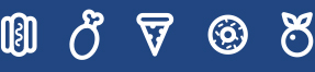
A Pumpkin to Die For
This Halloween we are resurrecting DesignBytes and what better lesson to do it with than explaining what DIE cuts are.
Design Speak:
Imagine that you are prepping your pumpkin to be transformed into the best jack-o’-lantern in the neighbourhood. You wouldn’t just go cutting freestyle for fear of marring your gourd so you mark where you plan on cutting. This is indicated by a dieline. After a piece has been printed, the process of cutting out the shapes using dies is called die cutting. A die cut element calls attention to the 3D nature of your material, be it paper or a pumpkin!
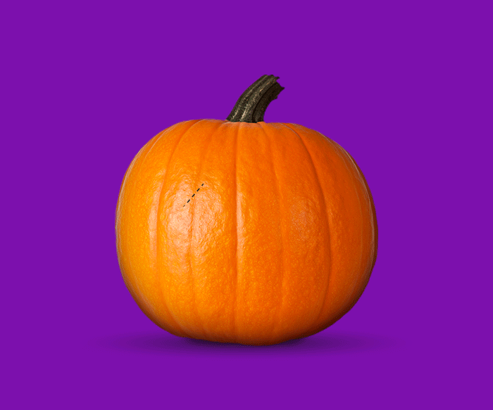
Chocolate Kern
Chocolate Kern
To celebrate Valentine’s day, we’re indulging in some design-geek humour with a typographic pick-up line:
“Baby, this Valentine’s Day I’m kerning “U” and “I” together.”
Design Speak:
In typography, kerning is the process of adjusting the spacing between characters in a proportional font, usually to achieve a visually pleasing result. It adjusts the space between individual letter forms. In a well-kerned font, the two-dimensional blank spaces between each pair of characters all have a visually similar area.
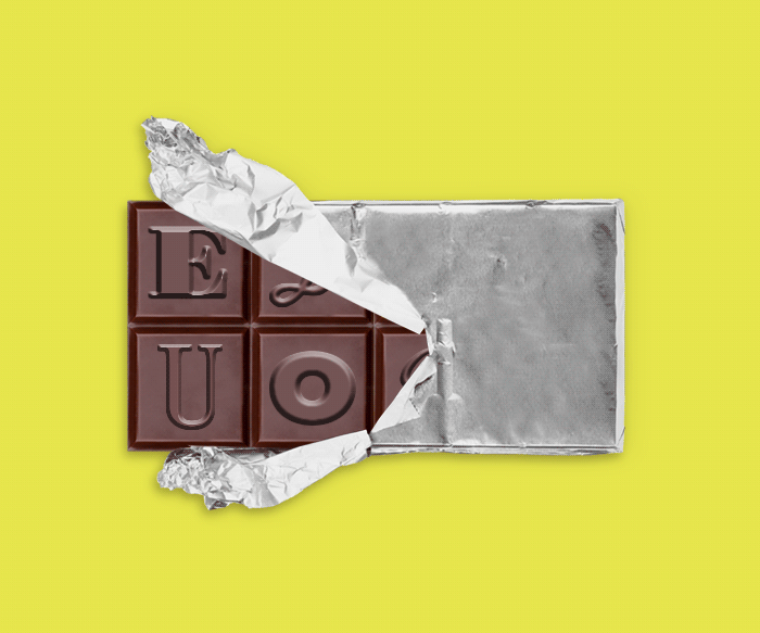
Gingerbread Type
Gingerbread Typography
Rags, widows, + orphans sound more like a festive Dickens’ novel than typography jargon so it makes it the perfect holiday DesignByte! These terms have to do with ensuring there are no weird gaps in text that will distract the eye while reading.
Rag refers to the irregular vertical margin of a block of type. It’s better for the rag to go in + out in small increments so the empty space doesn’t create shapes.
A widow is a short line or one word, at the end of a paragraph.
An orphan (like Oliver Twist) is a short line or one word at the beginning of a page.
Popsicle Expiry
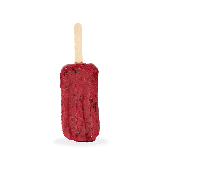
Popsicle Expiry
Have you ever sent your designer files through cloud-based file transfer services (think WeTransfer)? Those files have a shelf life + expire (like summer) after a certain amount of time. Just as if you left a popsicle out + it melted into a messy, sticky puddle.
Poutine Package
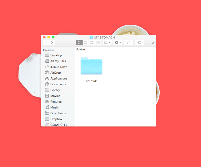
Poutine Package
Here’s a history lesson for you: Canada Day is celebrating the coming together of 3 colonies to make our great country! Honour the day off by indulging in a very Canadian snack, poutine! Poutine is the coming together of delicious foods (fries, gravy, + cheese curds).
Design Speak:
Packaged files is a command in Adobe InDesign that collects the elements that make up the layered file (such as fonts, links, + images) so it can be passed off to another designer who needs to be able to adjust the content. What makes poutine, poutine is combining fries with. Poutine is like a packaged file. Without gravy + cheese curds (+ bacon if you’re truly proud to be Canadian!) you’re just eating fries. Not as delicious.
Donut Design
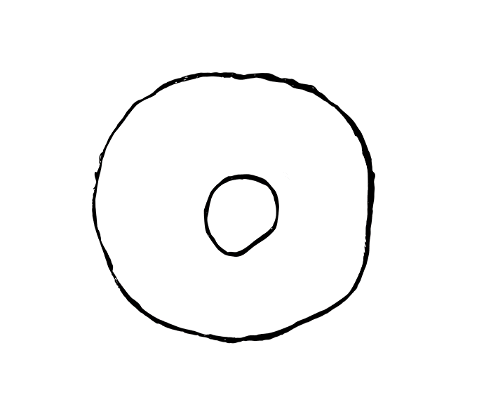
Donut Design Process
For National Donut Day, we decided to communicate the design process using Homer Simpson’s favourite food! At Cosmic, we approach every problem strategically, considering all the potential possibilities and pushing the limits of our imaginations. This allows us to develop innovative and elegant solutions with a defined objective. This is the basic process we follow:
- Explore the problem through research, determine objectives, limitations, etc…
- Brainstorm: Sketch it out! Start on the paper first and doodle out your ideas.
- Consider potential possibilities and variations of ideas before bringing it to the computer. More sprinkles? What kind of frosting? What kind of cake??
There are a lot of painstaking steps in the creative process before landing on the perfect solution.
Pizza Specs
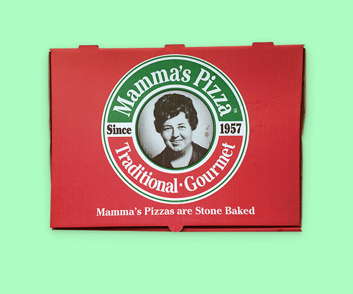
Pizza Specs
Designers United Against Crust! Here are pizza specs for crust-haters. Mamma’s is Cosmic’s pizza joint of choice!
Design Speak:
Bleed is the excess image area that must pass the trim dimensions to avoid having the image border accidentally print (a quarter inch is fairly standard).
Trim is the final size of a printed page after excess edges have been cut off.
Live Area is where your main typographic elements should be without worrying about their being cut off or cut off from view. This area ensures that your typography and main graphics will be seen.
Make It Pop
Make it Pop!
If everything POPS, nothing does!
Emphasis creates a focal point in a design; it is how we bring attention to what is most important. Emphasis is what catches the eye and makes the viewer stop and look at the image. Without emphasis, without getting the viewer to look at the image, communication cannot occur.
An important thing to remember about emphasis is that if everything is emphasized (all text is large and bold, all images are animated or flashing, everything is in bright colors) then nothing will stand out, nothing will be emphasized, nothing will grab the viewer’s attention.
(Definition via Donna Tersiisky)
Layered Sandwich
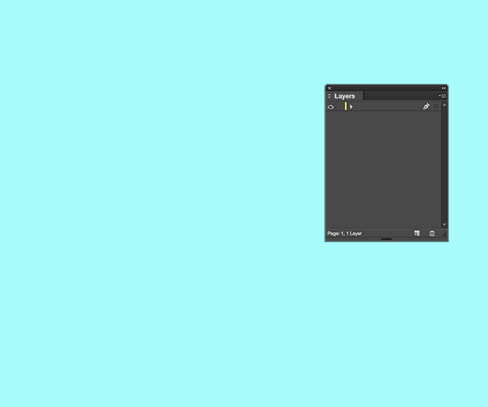
Layered Sandwich
The beauty of a layered file is the ability to edit. You can adjust the composition to suit your needs. For example, I will delete the layer of lettuce in favour of additional layers of meat :D
Design Speak:
A Layer is the term used to describe the different levels at which you can place an object or image file. In the program you can stack, merge or define layers when creating a digital image. Layers can be partially obscured allowing portions of images within a layer to be hidden or shown in a translucent manner within another image, or you can use layers to combine two or more images into a single digital image. For the purpose of editing, working with layers allows you to go back and make changes within a layer as you work.
(Definition via Webopedia)
Wheel of Candy
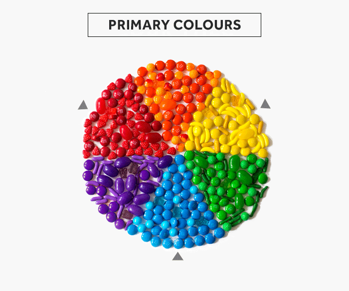
Wheel of Candy
Don’t take chances with your knowledge about colour theory and play the Wheel of Colour! The colour wheel creates a “logical structure” to understand how it is used and the context.
- Primary Colours: Red, yellow, blue. These are colours that cannot be created by the mixing of other pigments but all the other colours are derived from these.
- Secondary Colours: Green, orange + purple. The colours that are created by mixing the primary colours
- Complementary Colours are colours directly opposite from each other on the colour wheel. In combination, they create the most contract as well as stability.
- Triadic Colours are evenly spaced apart on the colour wheel. The result is a very vibrant palette so one should be dominant while the other 2 hues be used as accent.
- Warm Colours are made with orange, yellow and red. They appear to come closer or advance.
- Cool Colours are made with blue, green and purple. They appear to recede and create space.
St. Patty’s Colours
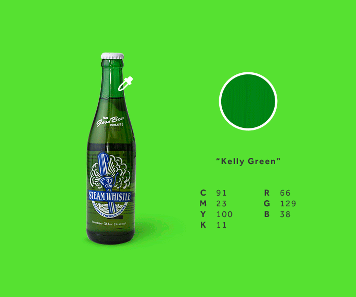
St. Patrick's Colours
CMYK = Print
RGB = Screen/Web
St. Patrick’s Day = GREEN + BEER!!!
Design Speak:
A good rule of thumb is anything dealing with the web should always be in RGB and printed material should be in CMYK. But very few designers and clients know why this is the standard.
F.Y.I:
CMYK = Cyan, Magenta, Yellow, Black
RBG = Red, Green, Blue.
If you’ve gotten “byten” with the design curiosity bug and want to learn more about CMYK vs. RGB, go here
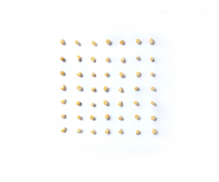
Easter Egg Align
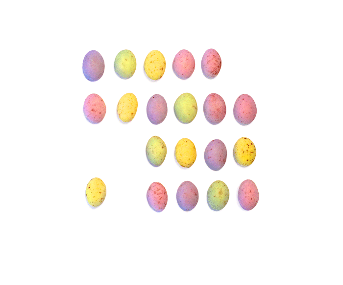
Easter Egg Alignment
How do you like your Cadbury’s Chocolate Mini Eggs to align (other than in your belly)? Right? Left? Center Justified?
Alignment is used in design to organize elements which will make the design more visually appealing.
Design Speak:
Left Adjusted Text is text that is aligned along the left margin.
Right Adjusted Text is text that is aligned along the right margin.
Centered Text is aligned neither to the left nor right margin; there is an even gap on each side of each line.
Justified text is spaced so the left and right sides of the text block both have a straight edge.